


Powerful Web & App Design That Works
What is App Design?
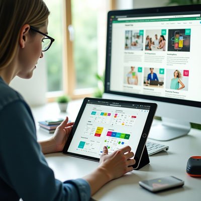
When I first started working on app design, I quickly learned that the look and feel of a mobile application go far beyond aesthetics. It’s about creating the kind of user interface that encompasses every detail color, font, and overall app style so the visual elements and interactive elements blend seamlessly. A good design combines both UI and UX, which is crucial. From my experience, if you don’t prioritize the user experience, even the best app ideas might never succeed. The impact of how users perceive and use your app often depends on small but thoughtful design choices.
I’ve helped teams with building everything from a fitness app to an internal employee app and even a feature-rich ecommerce app. In every category, the app functions must align with what people actually want. Creating a high-quality experience isn’t just about code it’s about making sure users enjoy coming back. That’s why it’s so important to invest at the beginning, not after the problems start. A smart investment in design early on can save you time and money, and it will likely ensure a higher ROI down the road. Making app design a top priority is not just smart it’s essential.
What Platform Should I Design For?
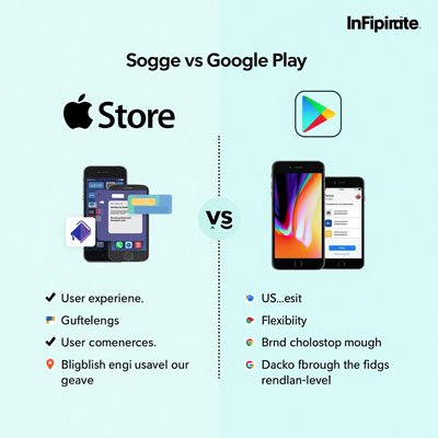
As an app design specialist, I’ve often helped app developers decide which platform to focus on first. In today’s world, most projects need to support multiple platforms, such as the Apple App Store and Google Play Store. But choosing between them isn’t just about popularity it’s about understanding key nuances. You have to think about designing for different operating systems, follow specific platform guidelines, and navigate the differences in the development process. For instance, Apple dominates the US market, while Android leads globally, and the target audience should help dictate where to begin.
iOS App Design
When working on an iOS app, I always consider how reliable, fast, and easy to use the platform is. One of the biggest benefits with Apple is the ability to debug design flaws easily. You can fix usability problems, deploy updates quickly, and maintain a seamless experience for your users. A good app design here means delivering a modern, intuitive, and sleek design that feels right at home across the Apple ecosystem from iPads, Apple Watches, to Macs. It also needs to stay compatible with everything Apple builds.
Android App Design
Android is a great choice when you want flexibility in your app building approach. Unlike Apple’s controlled space, it doesn’t have a closed ecosystem, so the design environment is much more open. Many iOS apps even start on Android due to its lower cost. For an app design beginner, Google’s knowledge base and reference material are helpful. It’s usually less expensive to publish an Android app, but you still need to think about integration with more than just smartphones you have to integrate with wearables, VR tools, Android Auto, and support all device types through the app store. Every detail matters, and consideration of various platforms is key when designing for Android.
What is Web Design?
I remember the first time I tried to create a simple web design project back in college. The tools were limited, and most websites were only built for desktop browsers. Over the years, the concept of design has changed drastically. What used to be static pages is now dynamic and engaging, thanks to the shift in focus toward user experience. While learning about software development, I realized that web design isn’t just about visuals it’s about how people interact with content. That’s when I started understanding the bridge between website development and how it shapes user expectations.
By the mid-2010s, something changed. Browsing habits shifted as people began using mobile and tablet browsers more frequently. Suddenly, it became ever-increasingly important to design layouts that looked great on all screen sizes. As a freelance developer, adapting to this change was essential. I had to re-learn how websites should respond to different devices. It wasn’t just about aesthetics it was about usability and functionality. So when you talk about web design today, it’s no longer confined to desktop browsers. It’s an integrated approach that blends design, development, and seamless user experience across all platforms.
Accessibility for Web Design

When I first started designing websites, I didn’t realize how significant accessibility was. As I gained more experience, I learned that good web design means creating an accessible website for all users, including those with varying abilities and disabilities. The goal is to make sure everyone can navigate, perceive, understand, and interact with the site using the right technology. A website should be built so that no matter who is visiting, they have a smooth and equal experience.
One of the first guidelines I followed was from the World Wide Web Consortium, also known as W3C. Their advice on using contrast between foreground and background was a game changer. Using black or dark gray text on a white or light gray shade helps with readability. I now regularly use color contrast checkers to test contrast ratio between text and background colors to ensure my content is easy to read.
Don’t use color alone to convey information
Many people with colorblindness may not notice subtle color changes. So I never use color alone to share information. For example, I add underlines to hyperlinked text so even if someone can’t see the link color change, they can still differentiate the hyperlink from regular text.
Ensure that interactive elements are easy to identify
For interactive elements, it’s vital to make them easy to identify. I apply distinct styles to links and add visual effects like a hover state. Users who rely on the keyboard should also be able to spot clickable areas quickly.
Provide clear and consistent navigation options
A clear and consistent navigation setup is essential. I use organized navigation options, keep consistent layouts, follow naming conventions, and ensure menu items don’t cause confusion. Features like breadcrumbs in the same position across all web pages help users stay oriented.
Ensure that form elements include clearly associated labels
When working with form elements, I always use visible labels placed next to the form field. For left to right languages, placing the input field with the label beside it avoids errors and confusion for users.
Provide easily identifiable feedback
Good feedback is everything. Error messages shouldn’t be in fine print or only in a specific color, as this fails for people with lower vision. Make sure users can identify, navigate, and fix different errors easily.
Use headings and spacing to group related content
To organize content better, I apply headings and proper spacing to group related content. A strong visual hierarchy using typography, whitespace, and grid layouts helps users scan content quickly.
Create designs for different viewport sizes
I always build designs that adapt to different viewport sizes. Whether on larger devices or smaller screens, content scales well. I ensure all my responsive websites test correctly across screen sizes.
Include image and media alternatives in your design
For accessibility, every image must have alternative text that communicates meaning. I also provide image alternatives, media alternatives, transcripts for audio and video content, and make sure text alternatives are used consistently even in PDFs.
Provide controls for content that starts automatically
One thing I always double-check is autoplaying media. I provide controls, so users can pause animations or video content that plays automatically. It gives them power over their browsing experience.
Is web design coding?
Not always. Web design mainly focuses on the visual layout and user experience of a website, including colors, fonts, and overall structure. While some designers also know HTML, CSS, or JavaScript, the actual coding is typically handled by web developers.
What is responsive web design?
Responsive web design means creating websites that adapt to different screen sizes and devices like phones, tablets, and desktops. It ensures that users have a smooth browsing experience no matter what device they use.
Is app design UX or UI?
It includes both. UI (User Interface) deals with the visual elements like buttons and layouts, while UX (User Experience) focuses on how the app feels and functions for users. A good app design combines both for a seamless and intuitive experience.
What does an app designer do?
An app designer creates the look, feel, and user experience (UX) of a mobile or web app. They focus on making the app visually attractive, easy to use, and functional for users.