


Master Visual Design with Powerful Simplicity
What is visual design
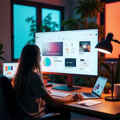
In my early journey as a designer, I realized how much visual design shapes a brand’s identity. It’s more than just making a website or app look good, it’s about creating a meaningful user experience. While graphic design focuses on visuals and UI design shapes the user interface, visual design blends both to guide how a finished product should look and feel. Whether you’re building a web app or a printed brochure, strong visual communication ensures your message is clear and emotionally resonant. As a visual communication designer, the goal isn’t just aesthetics but making every element work toward the larger communication purpose.
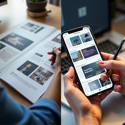
From defining visual languages for a brand to designing layouts using typography, color, space, and images, every piece plays a role. I’ve seen organizations succeed when their design projects stay true to both form and function. Visual designers don’t typically handle coding like HTML or CSS, which many web designers are expected to do. Instead, our focus is the discipline of design strategy translating abstract definitions into tangible design that enhances usability, supports conversion, and delivers a seamless experience across digital design. Whether it’s a landing page, mobile app, or full product, visual coherence from start to end product is what makes the job impactful.
Visual Design vs. Graphic Design
Comparing Roles in Modern Design
In my early career, I often found the line between graphic design and visual design incredibly blurred, especially when working on websites or a web app. Both disciplines share a focus on aesthetics, yet their goals and responsibilities are quite different. While graphic designers typically focus on print design or static digital designs, visual designers are more involved in crafting dynamic interfaces for websites, apps, and product experiences. I remember collaborating with a talented graphic designer on a project where my task was to handle the visual design things like layout fluidity, interface emotion, and the overall perception of the brand. It became clear that even though both roles overlap, each requires different tools and thinking. The end products may look similar at a glance, but the purpose and process behind them are not the same.
Understanding the Practical Divide
The difference in responsibilities also leads to a difference in salary. Based on my industry experience, graphic designers often cap at around $65,000, while visual designers can earn up to $90,000, reflecting the demand for cutting-edge UI thinking. The Visual Designer job title is often associated with forward-thinking roles, while graphic design is sometimes (unfairly) seen as a dinosaur among design disciplines. Still, both jobs require creative work and play essential roles in any design team. The overlap happens when responsibilities shift across mediums, but understanding these subtle differences helps teams work better and hire smarter. Whether you’re hiring or seeking a job title, defining whether you’re a designer focused on aesthetics for physical or digital mediums makes a huge impact.
Visual Design is Aesthetic, Strategic Design
As a designer, I’ve learned that visual choices aren’t just about making things attractive, they shape how users feel and trust what they see. A powerful layout starts with the first impression, which forms in just 50 milliseconds. That gut reaction is driven by how well the elements are arranged, how naturally the eye moves across the page, and whether things draw attention to the right aspects. Good visual design balances both aesthetics and functionality, guiding users with visual cues and helping them understand your product with ease. In my work, I always try to accommodate cognitive limitations by using chunking and designing around user load, so they can remember the information and interact smoothly without hesitation or uncertainty.
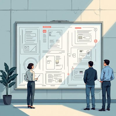
What makes a design vital isn’t just how it looks, but how it works. I’ve seen how consistency across every page builds trust, while fresh touches make things feel modern without overwhelming the user. Each moment is critical, and even the subtlest detail can affect how the user thinks or reacts. I always start by identifying the organization’s goals, then compose and organize the content to match both the culture and expectations of its users. Whether I’m designing items for a large website or a single product, I focus on the way everything works together how I create flow, build appeal, and ensure the design supports the message. It’s about designing not just with strategy but with empathy, and making sure every visual step serves a real purpose.
Visual Design, Analyzed
As a designer, I’ve learned that visual choices aren’t just about making things attractive, they shape how users feel and trust what they see. A powerful layout starts with the first impression, which forms in just 50 milliseconds. That gut reaction is driven by how well the elements are arranged, how naturally the eye moves across the page, and whether things draw attention to the right aspects. Good visual design balances both aesthetics and functionality, guiding users with visual cues and helping them understand your product with ease. In my work, I always try to accommodate cognitive limitations by using chunking and designing around user load, so they can remember the information and interact smoothly without hesitation or uncertainty.
What makes a design vital isn’t just how it looks, but how it works. I’ve seen how consistency across every page builds trust, while fresh touches make things feel modern without overwhelming the user. Each moment is critical, and even the subtlest detail can affect how the user thinks or reacts. I always start by identifying the organization’s goals, then compose and organize the content to match both the culture and expectations of its users. Whether I’m designing items for a large website or a single product, I focus on the way everything works together how I create flow, build appeal, and ensure the design supports the message. It’s about designing not just with strategy but with empathy, and making sure every visual step serves a real purpose.
Elements
In my design process, I always start by thinking about the elements that shape the overall layout. I use lines, shapes, and negative space to form structure and flow, with whitespace offering room to breathe and bring calm to the viewer. Whether it’s straight, curved, geometric, or organic, each line has purpose. I define areas using enclosed, self-contained forms, keeping a balance between blank space and positive shape. Applying the figure-ground effect, I create depth that feels intuitive. To give the interface a sense of rich, real-world presence, I build volume, play with value, and layer texture. Even on two-dimensional screens, my goal is to suggest three dimensions through the right use of light source, shadows, highlights, lightness, and darkness. Choosing a suitable theme, matching tone, and knowing how to catch attention, all play into building a strong relationship between design and audience. The surface of any interface is where experience begins.
Principles
Once the structure is in place, I rely on core principles to bring meaning and order. Unity and harmony guide how I arrange page elements so they belong together. Without this, users can feel distracted, or sense chaotic, misaligned layouts that break flow. I apply gestalt to better perceive how objects will be processed by the eye and use this to guide visual journeys. Clear hierarchy and smart placement help communicate importance at a glance. With thoughtful contrast, I introduce clarity and structure, while scale helps me highlight or minimize based on context. I adjust dominance and emphasize what matters most, often through visual depth. Every object, by its size or position, must either stand out or support the system. I strive to distribute details evenly, respecting differences while using them to accentuate the design’s rhythm and flow.
FAQS:
Q1: What does a visual designer do?
A visual designer focuses on the look and feel of digital and print interfaces. They create visually appealing layouts, choose colors, typography, imagery, and design elements to communicate messages clearly and engage users effectively.
Q2: What is visual communication design?
Visual communication design is the art of conveying ideas and information through visual elements like graphics, illustrations, layouts, and symbols. It blends creativity and strategy to make communication visually effective across various platforms.
Q3: Visual design vs. web design?
Visual design is concerned with aesthetics how things look, while web design includes both visuals and functionality, like coding and usability. Visual design is a subset of web design, focused specifically on presentation.
Q4: Is visual design the same as UX design?
No, visual design and UX design are different. Visual design focuses on appearance, while UX design is about the overall user experience, including how easy, intuitive, and enjoyable an interface is to use. Both work together to create successful digital products.