

Fonts and Typography for Stunning Designs
What Is Typography
When I first began working with typography, I quickly realized it was more than just choosing a font it was an essential art. It’s the thoughtful arranging of letters and text that makes any copy not just readable, but emotionally resonant. As a designer, I’ve seen how the right style, structure, and appearance can completely shift how a reader connects with a brand or story. Typography brings everything to life by creating clear, legible designs that guide the eye and set the mood.
Through careful choices, typography can convey messages that are visually powerful and appealing. Whether I’m working on branding, websites, or print, the emotional layer matters. Typography has the power to elicit specific emotions, even before a single word is processed logically. This is why the integrity of how we display words is just as important as the content itself. A good type layout not only looks good but speaks directly to the viewer.
Why Is It Important?

From my work in UI projects, I’ve found that typography is a vital part of creating any interface. It’s more than just picking fonts it’s a component that shapes the overall user interface design. A good layout creates a visual hierarchy, brings graphic balance to a website, and defines the product’s tone. When we use typography to guide and inform users, it helps optimize readability and accessibility, leading to an excellent user experience.
Typography as a Tool for Brand Identity

Typography as a Tool for Brand Identity
Over time, I’ve noticed that typography truly builds brand recognition. It can enhance the personality of a site and make users subliminally associate a specific typeface with a brand. A site using a unique, consistent style can build a strong user following. This not only earns trust, but also helps to carry the brand message forward across platforms and touchpoints.
How Typography Shapes User Decisions
The way we present text matters typography deeply influences decision making. A profound effect happens when users digest and perceive information that’s clearly conveyed. Using eye catching, persuasive fonts instead of weak ones helps reinforce the message and keeps the reader engaged with confidence.
Keeping Readers Engaged with Typography
I’ve seen how the right font holds the attention of readers for more than just a minute sometimes even half an hour. The difference between a bounce and long scroll can lie in how visually stimulating and memorable the design is. Typography plays a huge role in that process, guiding the experience from first glance to final click.
The Evolution of Typography Through Time
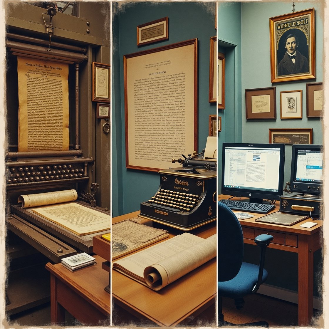
Looking back at the 11th century, the journey of typography began with the innovation of movable type, a breakthrough that forever changed how books, magazines, and even public works were produced. Back then, it was a specialized craft, practiced by a few and deeply connected with preserving knowledge. The Gutenberg Bible stands as a timeless symbol of this transformation not just a book, but a full revolution in the west.
Its unique style of type, called Textura, still exists today in the font lists of desktop applications under the dropdown menu.
Now, in 2025, I see typography integrated across both print and digital design like never before. The birth of the internet sparked a true creative explosion, opening endless options for web designers. The art of typography has evolved into something much more visually diverse, with an abundance of tools at our disposal. As someone who’s worked in this space, I find it fascinating how such an old practice still influences modern design so heavily.
Typography Essentials
Understanding Typography Elements Through Practical Use
When I first started exploring typography, I quickly realized it wasn’t just about choosing pretty letters it was a full design discipline grounded in elements that felt almost invisible yet completely essential. From a UI perspective, the typographical landscape is built on eight core components, each offering a unique grip on visual communication.
The elements I began with taught me that getting a firm grip on even the most basic font choices makes a huge impact. Typography is not just style it’s structure, clarity, and storytelling through letters.
The different elements of typography
I used to think fonts and typefaces were the same until I learned the real difference. A font is a specific graphical representation of a character, while a typeface refers to a family that includes multiple fonts with different weights, widths, sizes, and styles. The characters themselves form the visual language of a text, and the various styles that constitute a typeface give flexibility to match tone and purpose.
From bold headers to light body text, knowing when and how to use each font or typeface shapes how users experience your design.
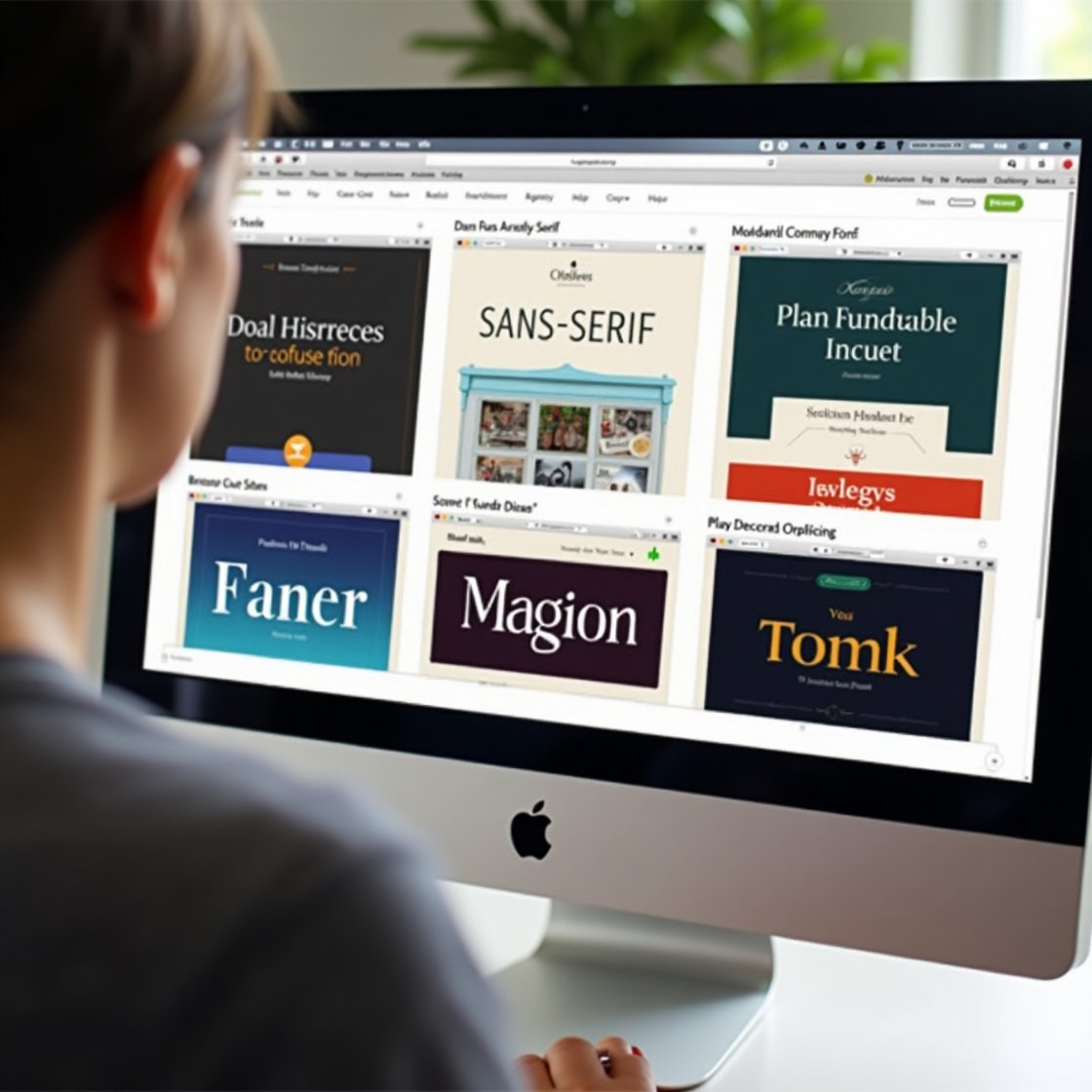
Serif: Traditional and Trustworthy
The serif style caught my attention early on because of its classic charm and sense of integrity. These fonts, with their extra marks or strokes at the ends of letters, bring a strong sense of tradition, authority, and history to a page. I often turn to Times New Roman or the original Microsoft Word font, especially when designing for books or newspaper titles. Though many modern systems replaced it in 2007 with Calibri, the timeless feel of serif still stands out.
Sans-Serif: Clean and Contemporary
The sans-serif family became my go to when aiming for a modern, bold look. Without the ornamental strokes found in serifs, sans serif fonts like Arial, Helvetica, or even the one you’re reading in this blog or article, provide a clear and readable design. These styles grab attention in headlines, giving any logo or UI design a sleek, powerful identity.
I often use it for digital interfaces, including Career Foundry’s own logo, or when writing in Google Docs, where it’s the default.
Decorative Fonts: Expressive and Unforgettable
Decorative fonts are where aesthetic meets personality. These are not for large bodies of readable text but shine when used in brand names, logos, or short titles. I’ve spotted them often in grocery and toy stores, designed to be visually playful and full of uniqueness and feeling. They give your design an edge of individuality and can help express a strong choice in tone.
Best UI Practices for Using Fonts
When designing interfaces, the best UI practices involve thoughtful use of fonts in context. A good designer keeps the interface streamlined and uncluttered, rarely using more than three fonts. I like to pair a sans serif title with a serif body text, ensuring clarity and visual balance. Keeping decorative fonts to a minimum is a golden rule that keeps everything readable.
Consistency: Clean and Cohesive Design
A consistent font style keeps your interface from looking confusing or messy. When you stick to a clear pattern, readers understand the information quickly. I use different fonts for headers and subheadings, but always ensure there’s a predictable structure. Consistency in typography builds familiarity and trust across any visual product.
White Space: Breathing Room for Clarity
Using white space, or negative space, was something I initially overlooked. Over time, I found that spacing around graphics and text, like margins, padding, or empty areas, enhances both visual appeal and readability. Even though it’s often unnoticed, it’s essential for a polished look and user-friendly layout.
Alignment: Structuring with Precision
Good alignment means more than just left justified text. It’s about unifying images, text, and other elements with equal space, size, and distance. I always refer to industry standards and consider whether readers are scanning from left to right, especially in western languages. Consistent alignment improves flow and ensures the interface feels intentional.
Color: Communicating Emotion and Clarity
Color is where creativity blooms in typography, but it must be used with care. I experiment with hue, value, and saturation to match the tone of the message. A well balanced text color makes copy eye catching yet legible, even for those with impairments. I often test my work in greyscale to see if it holds up, making tweaks when a font feels too dark or light against the background. Mastering this element comes from understanding theory and applying it in practice.
Hierarchy: Directing the Reader’s Eye
Hierarchy is a principle that changed how I present content. It determines what gets noticed and read first, especially with today’s short attention spans influenced by social media. To keep things concise, I use sizing, alignment, contrast, or even a visual clue like a red exclamation icon to highlight a call to action. Bigger headings, followed by medium subheadings and smaller standard text, create a natural flow for any reader.
Picking the Right Typeface for Your Website
Choosing a font for your website might seem easy, but the process of picking the right typefaces for your interface is often much harder than it seems. With so many different options to select from, it’s common to feel overwhelmed. Making the right choice isn’t just about seeing what looks nice it involves understanding the elements of typography and being fully familiarized with the key considerations.
Think about personality
Every time users enter a site, the atmosphere they experience is shaped by the personality the typography helps express. Do you want it to feel high end, playful, serious, or welcoming? It’s imperative to reflect your brand and product identity by defining the core traits you want to emulate. I always use that as a starting point when facing this challenge, and then I gather typefaces until I start noticing a trend.
Reflect on tone
The tone of your message should harmonize with your font style. If you’re trying to convey something important, avoid overly stylized or decorative fonts use something clearly legible that won’t cause distraction.
Don’t skimp on function
I’ve seen beautiful designs ruined by ignoring function. Even the most pretty typeface becomes useless if it’s illegible or makes users click the wrong button. When deciding, consider readable, accessible text with distinct characters, avoiding strain. Style and aesthetic matter, but voice should never overpower clarity.
Consider performance
Many designers often overlook performance using browser-friendly fonts from r
Whenever I’m not sure where to start, I take time to observe what other people are doing. By opening your eyes to the typography around you, whether through Pinterest, social media, or even just noticing patterns, you can gather ideas, see good and bad examples, and find guidance and inspiration from sources like UX Collective.
What is a font?

When I first started working with typography, I realized how important the font really is in shaping the feel of any text. A font is more than just how words appear it includes characters in a specific style and size, whether it’s for print or digital use. What makes it unique are the styles, like bold or italic, and the custom spacing used in its design.
Whether you’re working with lowercase or uppercase letters, or even punctuation marks, these details all fall under typography.
The type design of these characters is called a typeface, and when you group its variations together, it forms a font family. For instance, Helvetica is a font family, while Helvetica italic in 10-point is a particular font. Many people treat font and typeface as synonyms, even though they highlight different aspects of how printable or displayable text works. I often use Helvetica in my own designs because its clean style makes reading easy and visually pleasing.
The best advice I can give is to test everything. By gathering useful feedback from real users, you’ll gain clearer insight into what works, what doesn’t, and what may feel counterintuitive or clunky and ultimately, make better design choices.
What are examples of commonly used font typefaces and styles?
In my experience working on digital projects, I’ve noticed that there are limitless fonts and types available for use today, and the number seems to continue to grow. Many of these fonts are free, and graphic designers are constantly designing new ones. Because they’re capable of experimenting with different looks, this space keeps evolving.
You’ll find numerous styles, both traditional and modern, in circulation, which makes it exciting but also overwhelming for beginners.
Serif fonts
Serif typefaces are often seen in print and formal publications like books and newspapers. These letterforms have small embellishments called serifs, which give them a classic touch. Fonts such as Times New Roman, Georgia, and Courier are common serif examples that bring a sense of seriousness and structure.
Sans-serif fonts
When working on digital platforms like websites or online magazines, I often turn to sans-serif fonts. These have a modern look without the added serifs, which makes them feel clean and straightforward. Popular choices include Arial, Verdana, and Helvetica, especially for body text or UI content.
Script fonts
For special design needs like invitations or elegant documents, script fonts are a go to. These mimic the appearance of handwritten lettering, adding personality and flair. Brush Script, Calligraphy, and Freestyle Script are great options when you want a decorative or artistic feel in the text.
Display fonts
When I want to make something attention grabbing, I use display fonts, which are designed for specific sizes to emphasize a message or enhance readability in headings. Fonts like Comic Sans, Impact, and Papyrus help catch the eye and are useful in bold, creative layouts where text needs to stand out.
What are examples of commonly used font typefaces and styles?
When designing for both digital and print platforms, understanding font file types is essential. Over the years, developers like Apple, Adobe, and Microsoft have developed various font formats to support different needs on Mac, Windows, and other computers. One of the most commonly used types is TrueType, a standard originally built for simplicity and wide support. Another key format is OpenType (.otf), which offers scalable capabilities and supports more glyphs and symbols, making it ideal for modern design projects.
PostScript (.pfb, .afm) is another existing option, especially useful in professional printing environments, while bitmap fonts (.bmp) are created using pixels to build characters, though they are less flexible.
For web design, I often turn to the Web Open Font Format (.woff) due to its compact nature and ability to work well across websites. These types are optimized for performance and are easy to highlight within code. Whether you’re working in software or preparing design assets, knowing which unit, file, or format works best—especially when dealing with outline or scalable needs—can make a significant difference.
Each font format serves a unique purpose and must be chosen based on the total scope of the project and the platform it will be used on.
FAQS:
What is a font style example?
A font style example includes variations like Italic, Bold, Regular, or Light. For instance, Times New Roman Italic is a commonly used font style that slants text for emphasis or elegance.
What is the most commonly used font?
Arial is one of the most commonly used fonts. It’s a sans serif typeface favored for its clean, modern look, and is widely used in both digital and print media.
What are the 5 main types of fonts with examples?
The five main font types are:
- Serif (e.g., Times New Roman)
- Sans-serif (e.g., Helvetica)
- Script (e.g., Brush Script)
- Monospace (e.g., Courier New)
- Display (e.g., Impact)
What are the three types of typography?
Typography is generally categorized into:
- Display Typography (used for titles and headings)
- Body Typography (used for readable body text)
Handwritten or Decorative Typography (used for stylistic or artistic purposes)
What is the function of typography?
Typography’s main function is to visually present text in a clear and effective way. It sets the tone of the content, enhances readability, and influences how users interact with and interpret information.